Architecture
Learn what architectural design principles does the Victoria UI Kit follow. Its understanding is crucial to be able to build advanced ,
Versioning
Project adheres to Semantic Versioning. All releases and pre-releases are tagged in GitHub and changes summarised in project's changelog.
Styles
SASS, SCSS
Bourbon and Neat frameworks
ITCSS Architecture
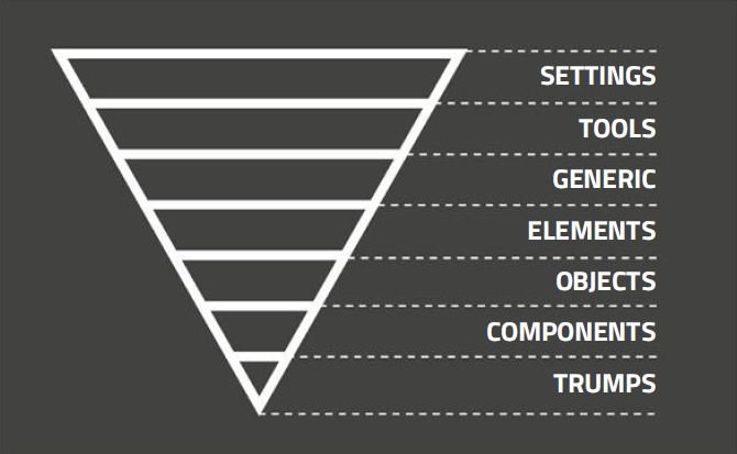
Victoria UI Styles follows Inverted Triangle Cascading StyleSheets (ITCSS) architecture - a set of principles and practices by which developers should group and order their CSS in order to keep the styles scalable, terse, logical, and manageable.
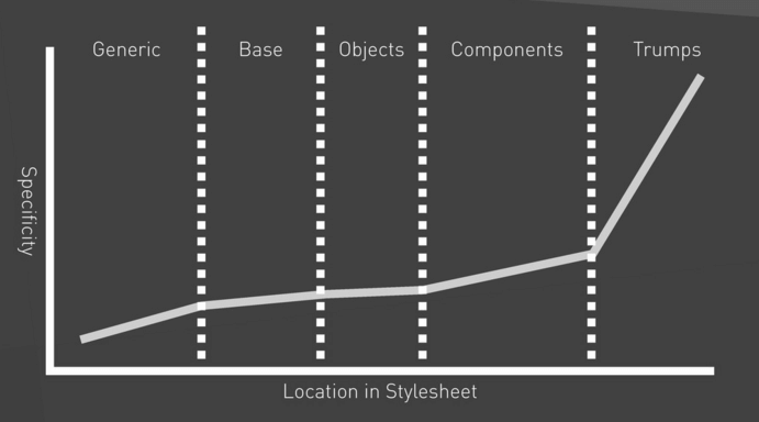
Simply said, ITCSS is building styles in layers from the lowest to highest specificity (~ from most generic rules to least generic rules).
As the specificity of every layer is gradually increasing, styles in every layer can easily build on top of the styles from all the layers before them (top to bottom):

This leads to a cleaner and more maintainable stylesheets:

Theming
Theming is handled by completely by SCSS. There is no body class to apply a theme, you must load a different css file. Follow these steps to declare a new theme:
- Create a new master file in the root styles folder with the filename:
toolkit.[your-theme-name].scss
- Copy/Paste the structure from toolkit.scss into your new master file.
- Create an override scss file in the _00-themes folder with the same name as your theme:
_overrides.[your-theme-name].scss
- To see you theme in action, add
theme: [your-theme-name]at the top of a material file so fabricator/handlerbars can load the new css.
Layers and structure
The library separates the styles into following layers, each represented by similarly named folders (ordered from most generic to least generic):
- THEME OVERRIDES - Variables which override defaults declared in the following files.
- SETTINGS - Configs, brand colors, spacing units, variables.
- TOOLS - Library's custom mixins, 3rd party mixins.
- GENERIC - Generic definitions, eg. resets, normalisations, imports of external styles and fonts.
- ELEMENTS (BASE) - Non-specific elements (= without classes or IDs), eg. body, h1, p ...
- OBJECTS - Simple atomic design patterns (= using classes only), eg. buttons, icons,...
- COMPONENTS - More complex designs (using classes only), eg. header, footer, searchbar...
- TRUMPS - Most specific, mostly overrides (usage of !important and IDs).
Learn more about ITCSS
- Manage large CSS projects with ITCSS (YouTube - 14:43)
- Harry Roberts - Managing CSS Projects with ITCSS, 1:13:51